My website redesign
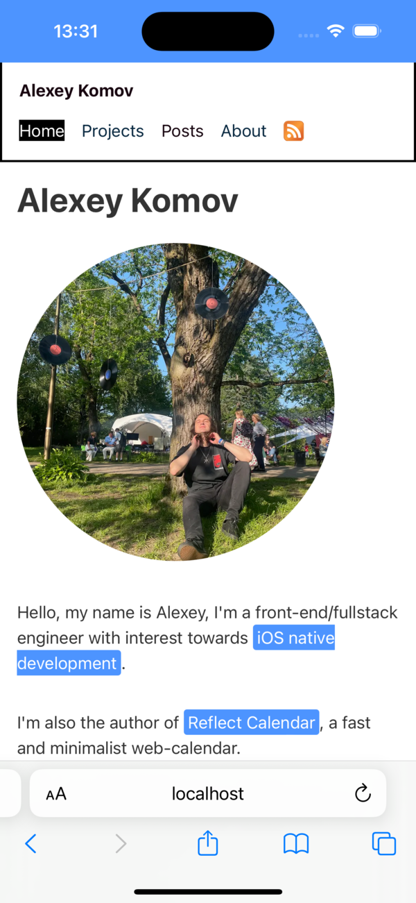
On the 1st of September I've finally updated my website at alexeykomov.me! As you're reading this, you are already seeing this work in production 🙃.
Nostalgic vibes
Historically, I had my personal website present at that domain a while ago. I think it was inspired by Anton Kovalev's personal website, though I can't find the exact reference now. I remember it was stylistically simple yet pleasant website with an avatar placed in border-radius: 50% frame.
I think the site served its purpose by providing the link to my resume and GitHub profile. I also remember at least one recruiter who contacted me after reading the website's invitation to send an email 😁. You can still visit the old site if you're so inclined.
At the same time I blogged a little at Medium, which is the platform I sincerely liked then and continue to like now, despite the fact I don't read it often now. I think my initial love for Medium was inspired by the fact that it was built right in front of my eyes with the technologies I like. I remember Dan Pupius wrote the post with the words
the choice then was Obvious
and this is the point where I started to track the changes to the Medium platform. Extra value of the product built by notable ex-Googlers and other great engineers is that a lot of insightful posts appeared there on engineering. I also loved how easy and pleasant from a UX perspective it was to put text using their UI.
Oh and by the way, Medium is a treasure trove for other engineering stories: take the one about font called "System", for example. Did you play the remake of System Shock 2, by any chance?
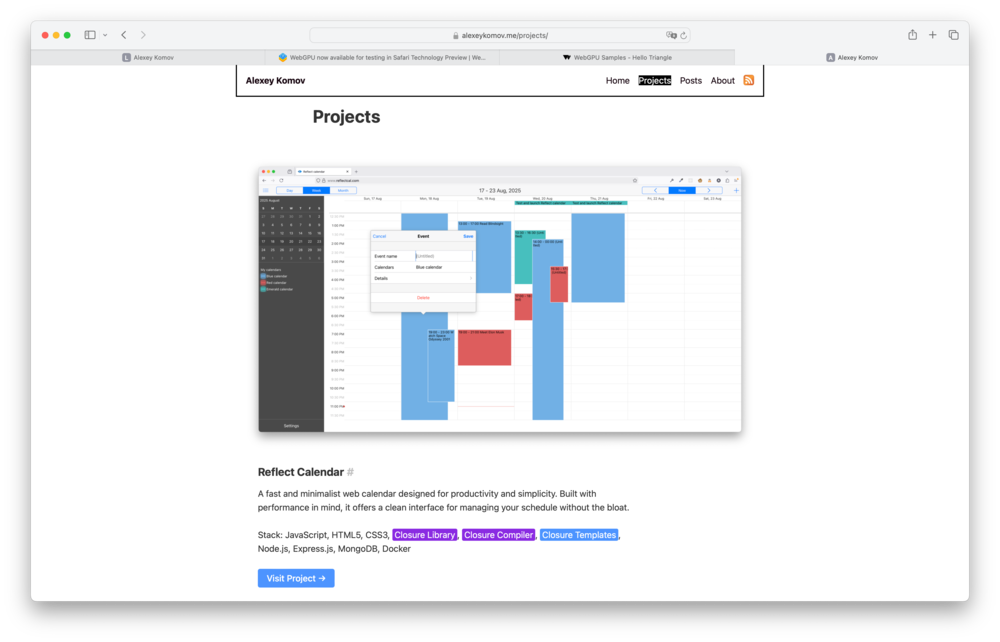
Over time, however, I felt that I needed some place of my own to put my blog. This was falling nicely in the direction of indie web articles I've read from Tim Marinin. But even more than that I wanted to have all things in one place - both list of the projects and the collection of posts.
Tech stack
I was definitely thinking of the site as a bunch of static pages and static files. After all, what is the use of server code for me? Ironically, later I wanted to add likes👍 system for posts, which implies you need some server code after all. Having a little experience in working with Radzima's landing page which was using Eleventy, I chose Eleventy to be the base site platform for me.
Pictures
I tried to use responsive images with the <picture/> tag as much as possible, here's the example of avatar, which is quite convoluted I admit - it uses even jp2 format. I think the suggestion came from the post by David Walsh - at the time webp wasn't supported in iOS.
<picture>
<!-- Dark mode avatar -->
<source media="(prefers-color-scheme: dark)" type="image/webp" srcset="/img/avatar-dark-1x.webp 1x, /img/avatar-dark-1.5x.webp 1.5x, /img/avatar-dark-2x.webp 2x, /img/avatar-dark-3x.webp 3x">
<source media="(prefers-color-scheme: dark)" type="image/jp2" srcset="/img/avatar-dark-1x.jp2 1x, /img/avatar-dark-1.5x.jp2 1.5x, /img/avatar-dark-2x.jp2 2x, /img/avatar-dark-3x.jp2 3x">
<source media="(prefers-color-scheme: dark)" type="image/jpeg" srcset="/img/avatar-dark-1x.jpg 1x, /img/avatar-dark-1.5x.jpg 1.5x, /img/avatar-dark-2x.jpg 2x, /img/avatar-dark-3x.jpg 3x">

<!-- Light mode avatar (default) -->
<source type="image/webp" srcset="/img/avatar1x.webp 1x, /img/avatar1.5x.webp 1.5x, /img/avatar2x.webp 2x, /img/avatar3x.webp 3x">
<source type="image/jp2" srcset="/img/avatar1x.jp2 1x, /img/avatar1.5x.jp2 1.5x, /img/avatar2x.jp2 2x, /img/avatar3x.jp2 3x">
<source type="image/jpeg" srcset="/img/avatar1x.jpg 1x, /img/avatar1.5x.jpg 1.5x, /img/avatar2x.jpg 2x, /img/avatar3x.jpg 3x">
<img src="/img/avatar1x.jpg" alt="Alexey avatar" class="avatar" style="width: 300px; height: 300px; border-radius: 50%; margin-bottom: 1rem;">
</picture>
And another example of cover picture:
<picture>
  <source
    type="image/avif"
    srcset="/img/reflect-cover-1000.avif 1000w,
            /img/reflect-cover-2000.avif 2000w,
            /img/reflect-cover-3000.avif 3000w"
    sizes="(min-width: 928px) 928px, 100vw" />

  <source
    type="image/webp"
    srcset="/img/reflect-cover-1000.webp 1000w,
            /img/reflect-cover-2000.webp 2000w,
            /img/reflect-cover-3000.webp 3000w"
    sizes="(min-width: 928px) 928px, 100vw" />

  <source
    type="image/png"
    srcset="/img/reflect-cover-1000.png 1000w,
            /img/reflect-cover-2000.png 2000w,
            /img/reflect-cover-3000.png 3000w"
    sizes="(min-width: 928px) 928px, 100vw" />

  <img
    src="/img/reflect-cover-1000.png"
    alt="Reflect Calendar cover"
    width="1000"
    height="574"
    srcset="/img/reflect-cover-1000.png 1000w,
            /img/reflect-cover-2000.png 2000w,
            /img/reflect-cover-3000.png 3000w"
    sizes="(min-width: 928px) 928px, 100vw" />
</picture>
Wow, that's quite a snippet! Important part here is that we aim for specific picture widths and when that width condition is satisfied, a proper format/size combination is served to the user. Attribute sizes may contain media queries for the viewport.
By the way, looking at the avatar picture snippet, you can see that I've taken advantage of media query to change the image source according to the dark mode, this is one of the gimmicks of the redesign.
For the rest of the pictures it's at most the triad of avif, webp and either jpg or png fallback (no jp2 anymore). There are a few vector images as well. These commands can be handy for format conversion:
#AVIF versions:
magick public/img/site-comparison.png -resize 300x -quality 60
public/img/site-comparison-300.avif
magick public/img/site-comparison.png -resize 600x -quality 60
public/img/site-comparison-600.avif
magick public/img/site-comparison.png -resize 900x -quality 60
public/img/site-comparison-900.avif

#WebP versions:
magick public/img/site-comparison.png -resize 300x -quality 60
public/img/site-comparison-300.webp
magick public/img/site-comparison.png -resize 600x -quality 60
public/img/site-comparison-600.webp
magick public/img/site-comparison.png -resize 900x -quality 60
public/img/site-comparison-900.webp
Composite images
One of the pleasant surprises I've discovered during this work is the composite images. When putting several thin screenshots in a line, it's actually really nice to have single composite image out of them - it's way easier to account for in markup. Here's Image Magick command that can do this for you:
magick public/img/site-before.png public/img/site-after.png
  +append public/img/site-comparison.png
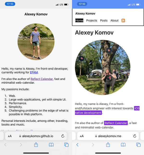
This is the command that was used to make comparison image of this site's state before and after redesign.
Formulae
One of the posts features formulae in it. I love the idea of using MathML directly on the page nowadays, it wasn't always like this - I still remember that standard working in Firefox but not in Chrome.
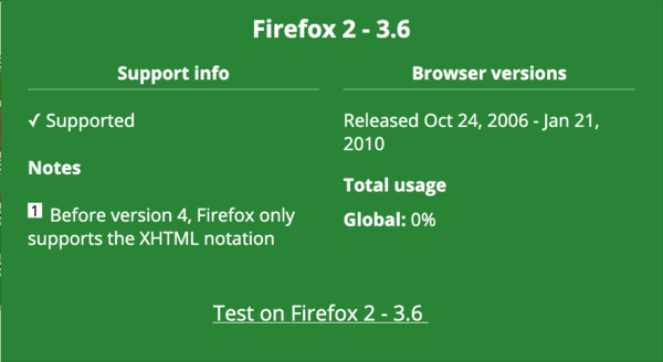
Hence I have raster image fallbacks for the formulae. Let's test the browser you're in! You should see the mass-energy equivalence equation below if your browser supports MathML.
Small side quest with parentheses
It's actually funny that after I tested the formula in Firefox desktop and iOS Safari results were different and it's Firefox who wasn't correct. Web development, right? The formula I used initially was using <mfenced> tag.
<math xmlns="http://www.w3.org/1998/Math/MathML" display="block">
		<mrow>
		<mi>E</mi>
		<mo>≈</mo>
		<msub><mi>m</mi><mn>0</mn></msub>
		<msup><mi>c</mi><mn>2</mn></msup>
		<mo>+</mo>
		<mrow>
				<mfrac><mn>1</mn><mn>2</mn></mfrac>
				<msub><mi>m</mi><mn>0</mn></msub>
				<msup><mi>v</mi><mn>2</mn></msup>
				<mfenced open="(" close=")">
				<mrow>
						<mn>1</mn>
						<mo>+</mo>
						<mfrac>
						<mrow>
								<mn>3</mn>
								<msup><mi>v</mi><mn>2</mn></msup>
						</mrow>
						<mrow>
								<mn>4</mn>
								<msup><mi>c</mi><mn>2</mn></msup>
						</mrow>
						</mfrac>
				</mrow>
				</mfenced>
		</mrow>
		</mrow>
</math>
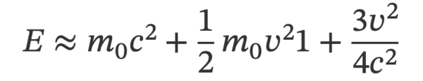
It turns out mfenced tag is deprecated. When parens are replaced using <mo> tag, everything looked fine (you saw that formula rendered above if your browser supports MathML):
<math xmlns="http://www.w3.org/1998/Math/MathML" display="block">
	<mrow>
		<mi>E</mi>
		<mo>≈</mo>
		<msub><mi>m</mi><mn>0</mn></msub>
		<msup><mi>c</mi><mn>2</mn></msup>
		<mo>+</mo>
		<mrow>
			<mfrac><mn>1</mn><mn>2</mn></mfrac>
			<msub><mi>m</mi><mn>0</mn></msub>
			<msup><mi>v</mi><mn>2</mn></msup>
			<mo>(</mo>
			<mrow>
				<mn>1</mn>
				<mo>+</mo>
				<mfrac>
					<mrow>
						<mn>3</mn>
						<msup><mi>v</mi><mn>2</mn></msup>
					</mrow>
					<mrow>
						<mn>4</mn>
						<msup><mi>c</mi><mn>2</mn></msup>
					</mrow>
				</mfrac>
			</mrow>
			<mo>)</mo>
		</mrow>
	</mrow>
</math>
Code blocks
As you can tell from all these convoluted xml blocks above, I like code samples. I use Shiki for code syntax highlighting and I love it. I like the idea of highlighting applied at build time as opposed to other runtime highlighters. This post is what helped me to integrate Shiki to Eleventy setup.
Hosting and domain
The previous site was hosted via GitHub Pages which was sufficient at the time, also it was important for me that the hosting is free. With the new version, I chose to move to Netlify with their free tier. It was nice to see that Netlify supports Brotli encoding.
HTTP/2 200
accept-ranges: bytes
age: 0
cache-control: public,max-age=0,must-revalidate
cache-status: "Netlify Edge"; fwd=miss
content-encoding: br
content-type: text/html; charset=UTF-8
date: Thu, 04 Sep 2025 11:30:09 GMT
etag: "ba4ba4eb10e05c9cefe80821a7fdfa54-ssl-df"
server: Netlify
strict-transport-security: max-age=31536000
vary: Accept-Encoding
x-nf-request-id: 01K4A7VG78231MNH8KX095X2Z8
X-Firefox-Spdy: h2
Or I should stop wondering at such things already? 🤔
Domain redirect to Netlify wasn't so smooth, surprisingly. My domain lives with GoDaddy, and a casual login there didn't work - they rejected my Belarusian phone number. So I filed a request with support and waited for ~3 days to get my 2nd factor changed to e-mail, then I could login and remap domain to Netlify's name servers. Another thing worth mentioning about GoDaddy is that they do not support ALIAS, ANAME, flattened CNAME records, only A ones.
Remaining challenges and conclusion
There are still some remaining challenges I'd like to tackle:
- I'm yet to improve the PageSpeed Insights score, mostly by using even lighter image sources
- I want to add a 👍 system for posts, which would require implementing some server-side functionality and proxying via Netlify
Here's a comparison showing the before and after of the redesign:
Hopefully now I will be able to get a benefits from having a blog - like better structured memories of the events. Thank you for your attention.